A small in-development review of the level design of Into the Belly of the Beast:
Today we want to loose some words about the level design in Into the Belly of the Beast and what we learned about it while playtesting our game with a closed group of testers ranging from 12 year old youngsters to seasoned gamers around 30.
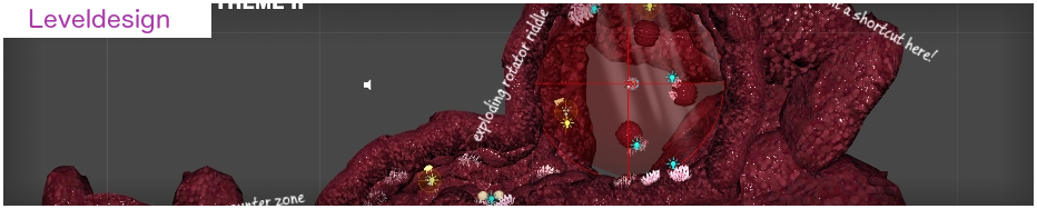
In Belly of the Beast you navigate Sploosh the lovely sea worm through a 3D world but only on a two dimensional playing field which is meanwhile known as 2.5D: Games like Super Mario or Castlevania but in a fully fleshed out 3D environment.
But, unlike the mentioned games, you’re surrounded by water for the full playtime which changes the overall gravity impact on you. If you do a jump with Mario, you’re drawn back to the ground afterwards, but not so with Sploosh. You can swim with him in all directions and will only have the impact of the waterflow. If you want to reach something above you, no jump is necessary for it, you can just swim in the upper direction.
This direction of this movement style is surely explored but definitely not oversaturated. So, because of that, when the first prototypes were done, we designers had some of our level-conepts held behind our backs before we showed them the rest of the team. We wanted to see how they solve the levels on first sight without knowing them before, because, if you don’t have many similar games at hand, it’s important to find the right way in the jungle of new possibilities.
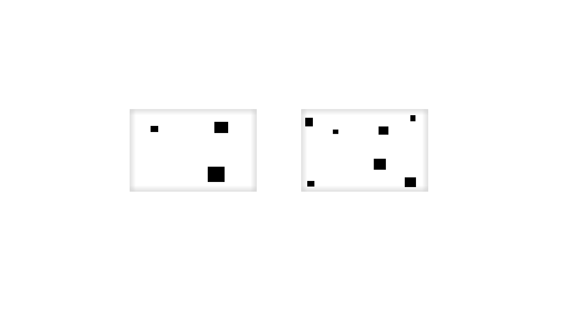
It turned out that the most of our team had problems to find their way through the levels or needed more time than it should.
In sidescrollers we are used to navigate our hero to the right display border most at the time. This was one of the things that worked out intuitively, but those games normally feature a ground plane to which the players is always drawn if he jumps and so on. So, one does have a roughly control about the players height position in the level at every moment, but if this is missing and the player has to take some ways out of the norm ( e.g to the south-west ), it can quickly lead to confusion.
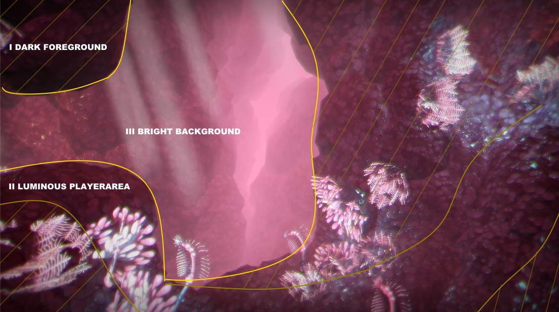
Our first solution was to simply expand the player's view so that he is able to see more of the gameworld and their point of interests. It was a quick and easy idea, but everyone in the team felt comfortable with it and prefered it over the old frustum.
In addition, we increased the dark-bright and the colour-in-itself contrast. Due to the 3D-depth it was even more important to bring out the spaces the player is able to swim in. Best case: He should never ask himself if he is able to swim around the obstacle before him or not. He should directly recognize that it’s impossible to swim around and not question it. To point that out, we brightened up the background but toned it down near the players swimmable area so that it only got a luminous shine on it with the player (and all interactable objects) being the brightest. Everything in front of that is really dark like a silhouette, an impassable obstacle.
After getting to this consense we were at that point where you’re getting so used to your game, that it get’s complicated to judge it yourself objectively. Luckily it met the point where we had our first playable demo ready too, so we grabbed that chance and did an in-house playtest in our studio with close friends but also some volunteers.
We learned much from it and rewrote some critical parts but level design-vise we nearly got the same feedback from every tester: It looked pretty, it was always clear where the swimmable regions were, but the orientation still wasn’t satisfying.
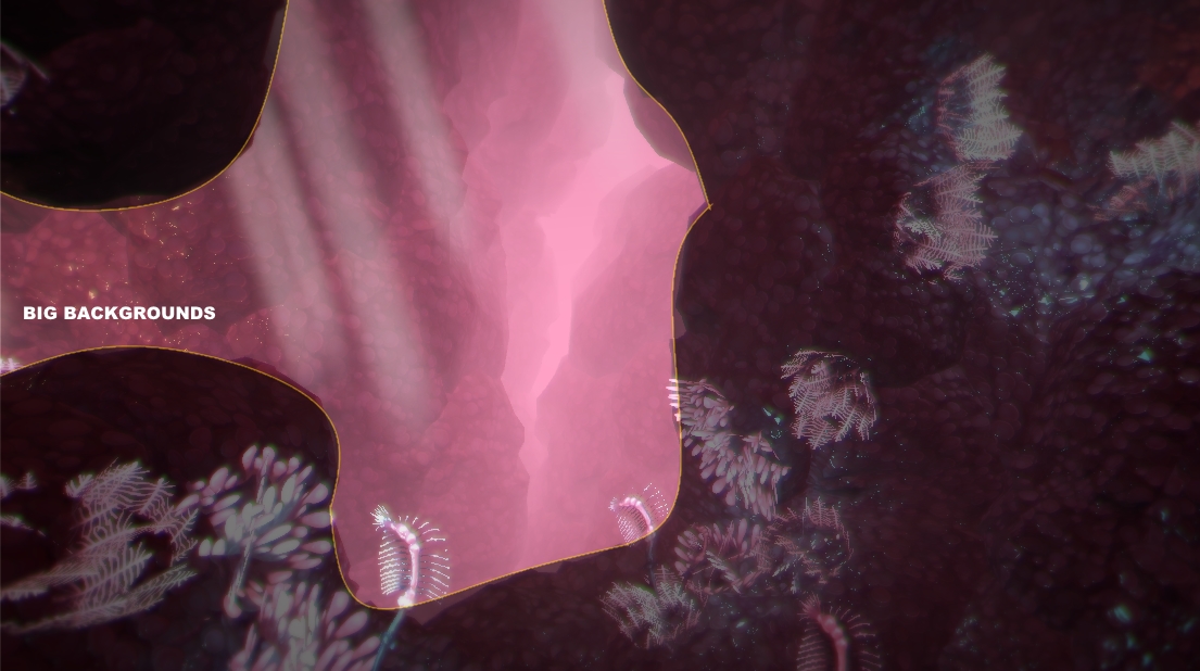
We solved this last problem by creating strong(er) backgrounds with a greater distance than before. If the background is near to the player it disappears faster from the frustum. A common thing with sidescrollers lacking the ability to allow the player to turn himself around his axis but, in our case, a real neckbreaker because having an unusual and organic environment is even more complicated or partly unpossible to associate with familiar silhouettes (especially for first time players). So, moving our background in a greater distance was a good solution, allowing the player to have a fixpoint in the distance while moving around it in the foreground and even give him long enough time to keep the organic form in mind to remember later on. That makes it easier for him if he crosses a similar form later on or comes back to it if he wants to.
And, after a second play session and some new levels, we’re proud to say that no one got stuck anymore.
We hope you enjoyed this small insight in the design process and the things we learned and improved while developing Into the Belly of the Beast!
Have fun and till next time!
Add new comment